Let’s start this Friday off by sifting through the noise, providing some perspective (as opposed to freaking out after watching an episode of your favorite political news (ahem… entertainment) station. J
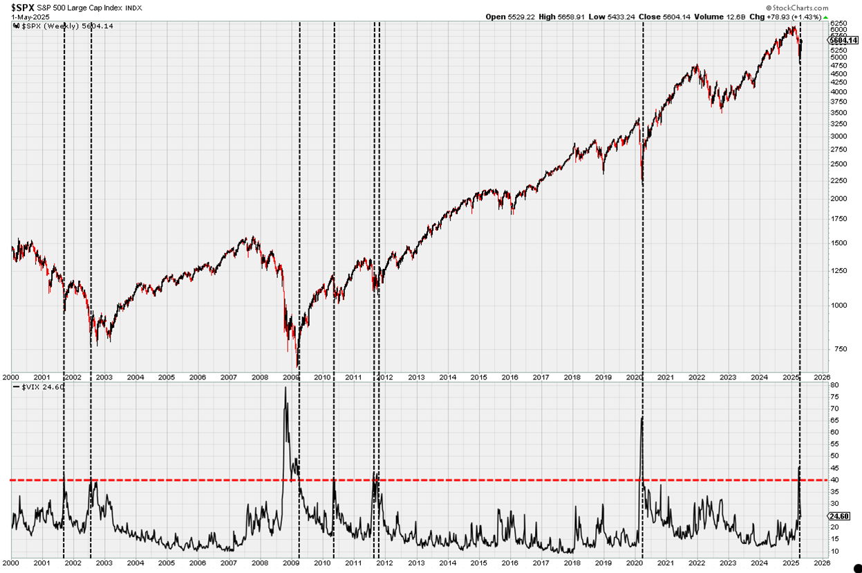
Below is the S&P500 in the upper pane, and the Volatility Index (VIX) in the lower pane. I drew a horizontal red line at 40, because the VIX doesn’t cross above/below 40 very often.
In fact, you have to squint to see these crosses in 2010 and 2011, but here’s the point…
There have only been 7 times in more than 25 years that the VIX crossed above/below 40, and when it did, it marked pretty close to the bottom of the market when the S&P500 was in a cyclical bull.
However, when you look at 2000-02, you can see that during a cyclical bear market, this signal did NOT mark the bottom.
So, ask yourself… “Are we in a cyclical bull market – or are we in a cyclical bull market?”

I’m seeing a lot on the internet about the outperformance of international stocks vs. U.S. stocks these days, and there are two things I don’t like about it.
First off, every investor has their own timeframe, and this outperformance is currently short-term, not intermediate or long-term. So unless you’re a short-term trader, this shouldn’t mean much to you right now.
The problem is, most investors don’t understand their own timeframe, and many of those posting on social media who are calling on International Stocks to be the new market leaders don’t trade with real money. Rather, they merely share their opinion or analysis.
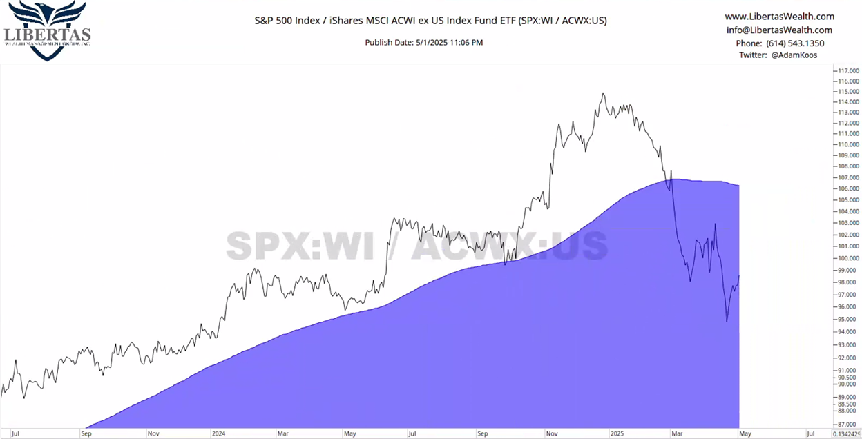
With that, here’s a chart of the relative strength (RS) relationship between the S&P500 and the All Country World Index Ex-US (ACWX) with a 150-day moving average (150MA).
When the chart is trending up and to the right, the trend is up and in favor of U.S. stocks. When it’s trending down, international stocks are in favor. I add the 150MA to all my RS charts just to have a line-in-the-sand that determines whether RS is trading above or below that line, and whether the line itself is sloping up or down.

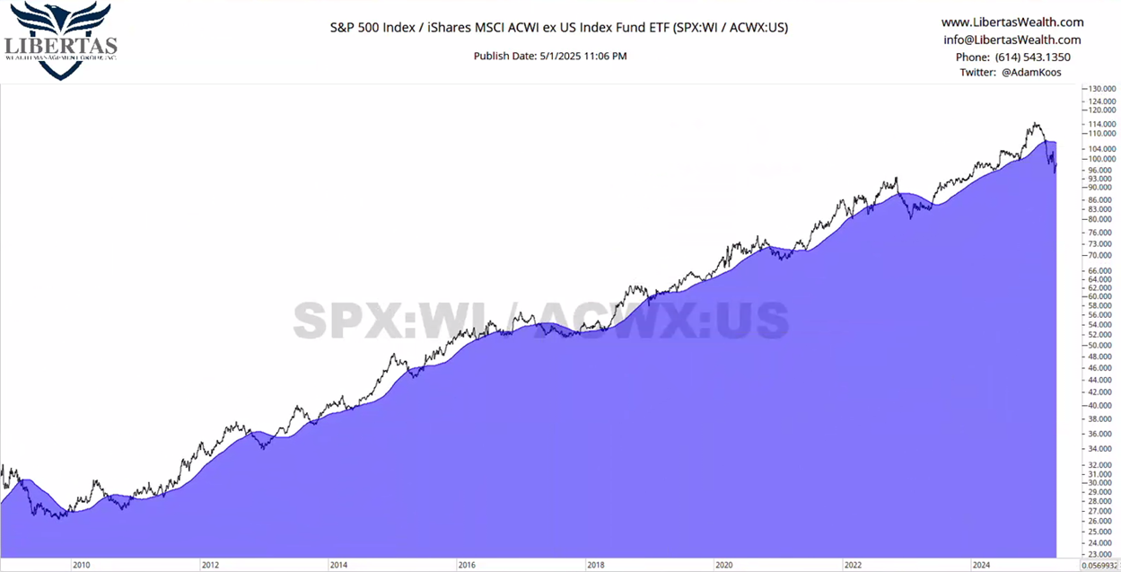
It looks like international stocks are truly outperforming, doesn’t it?! Well… what if we zoom out (see below)?
As you can see, if we go all the way back to the bottom of The Great Recession, the RS relationship between U.S. and International Stocks has done what it’s doing right now… MANY times before!
So, is this the real thing this time, or is this just another head-fake?
For me, I would need to see the RS chart climb back up toward the 150MA, try to get “above water” (i.e., above the blue 150MA line), and fail, heading back down again, printing a new, lower-low – and for now, that simply hasn’t happened yet.

As for the U.S. stock market… just wow! What a difference a month makes. If you went into cryo-sleep on April 1st and woke up on May 1st, almost nothing would’ve happened – stock prices would’ve been in (roughly) the same place they were a month ago!
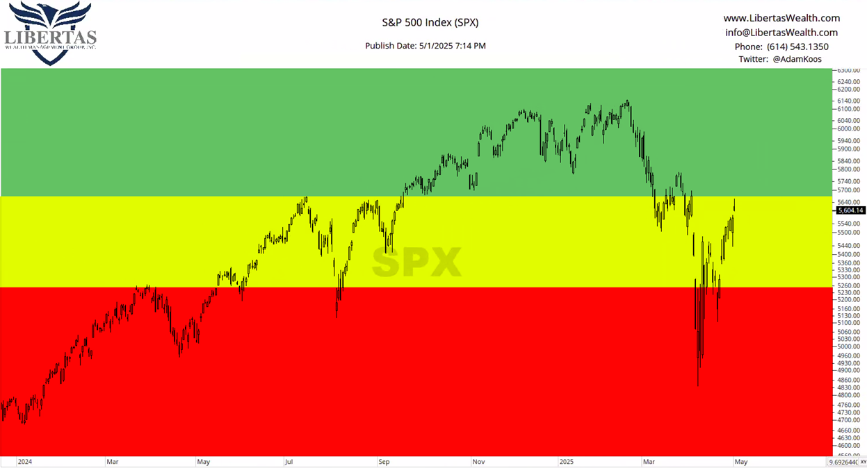
- While we spent some time in the “DANGER Zone” this past month, the stock market is right back in the “Caution Zone.”
- The bottom of the “Caution Zone” still resides at the spring 2024 lows, which took place after a market correction of just over -10% (sound familiar – this is happening now!),
- …and the “DANGER Zone” still sits just south of 5,000 on the S&P500.

It’s difficult to see, but the S&P500 rose off the early-April lows, pulled back, and then headed higher again, which resulted in a “higher-low” – or in other words, we find ourselves in the midst of a short-term uptrend. The question is, “Will it hold?”
I think it will… and for several reasons:
- Investors have been just as negative (if not worse) than COVID, the mortgage crisis, and the dot-com bubble (this is a contrarian sign),
- Tariff concerns are starting to wane and even China is starting to come to the negotiation table.
- “Liberation Day” (aka: “Strangulation Day”) looks to have been an emotional, news-driven selloff as expected,
- The VIX (volatility index or “fear gauge”) has fallen decisively below levels that have previously been favorable buy signals for the stock market,
- There have been a few, very positive breadth thrusts (which indicate widespread participation in the markets), and
- There are signs that sellers are starting to dry up.
Our tactical, trend-following portfolio models, which were heavily invested in cash and bonds in early-April, have started to scale back into stocks again with 25-67% of each model being invested, depending on the model in question (the remainder being invested in short-term bonds and cash).
If this market continues to “heal” and improve, then we could quickly see these nimbler portfolios fully invested before too long… and if this recent rebound is just a head-fake, then we’d be dialing down the risk again just a soon as the market climate indicates the tornado sirens are going off.
Meanwhile, we’re taking things day-by-day!
Unlock exclusive gold and silver trading signals and updates that most investors don’t see. Join our free newsletter now!

