Solid continuation but
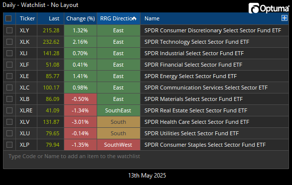
Tuesday turned out to be another solid day for the Tech-leaning sectors and the NASDAQ 100 index. Yesterday I showed a list of the 11 sectors of the S&P 500 and their headings on the RRG Graph, where the sectors with a “Northeast” heading were showing the most strength. As you may recall, those were: Consumer Discretionary (XLY), Technology (XLK), Industrials (XLI), Financials (XLF), and Communication (XLC).
Today, for a day that saw a positive move in the S&P 500, there were 5 sectors that closed lower – none of which were on the “Northeast” list from yesterday. Additionally, there are now two additions to the South-bound direction: Health Care (XLV) and Utilities (XLU).
Seeing the Health Care sector get hit today wasn’t too surprising with the news that there is a potential for drug prices to be capped. Top stocks in the XLV ETF are names like: Eli Lilly, Johnson & Johnson, Abbott Labs, Merck, etc.

Health Care (XLV) already looked ugly
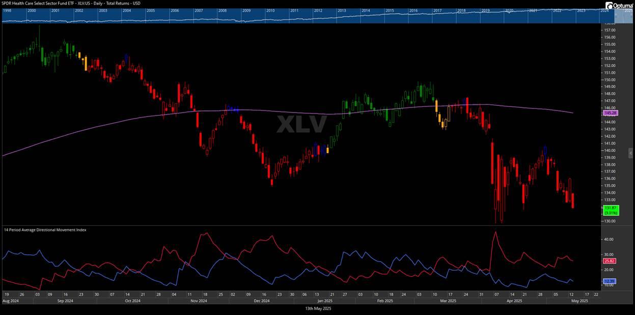
But the Health Care (XLV) chart already looked ugly. If you got hit by that one today, you weren’t paying attention. The “don’t buy” signs have been present and plentiful.
The current price for XLV has been solidly under the 200-day simple moving average since mid-March. Directional Movement has shown Red over Blue since mid-March. Directional Movement has become one of my go-to indicators since going through the CMT program. And the RRG Trend bars have also shown orange or red since mid-March.
While there was a nice attempt at a break above the mid-April highs, that attempt promptly failed on the first of May. Seeing higher-highs and higher-lows tend to be a good sign, but that ultimately didn’t work out for XLV.
Going back to my comment from Monday regarding XLV on the RRG Chart: “Healthcare appears as if it will skip the Green box and go straight back to Red.” It is still holding onto its position in the Blue (Improving) box for now, but it won’t take much to get it back into the Red (Lagging) box. Another weak sign for this sector.

High yield can help with context
An index that isn’t always easy to find, but that helps me stay on the right side of the market, is the ICE Bank of America US High Yield Master II Index (MLHY- in FastTrack). Yes, that’s the full name of it and you should know about it. And while it does, kind-of, act like the iShares High Yield Corporate Bond ETF (HYG), when using MLHY- with moving averages, it tends to have a smoother line with less whipsaws.
I got this one from Rob Bernstein of RGB Capital many years ago and it reminds me that you don’t have to take big risks to make decent “equity-like” returns. The high-yield market can be worth a look as an addition to an equity model as it can help you improve the risk-adjusted results of your portfolio. But, like any investment, it carries its own risks. So be sure to do your homework first.
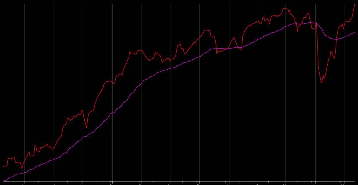
The chart below is a one-year chart of the MLHY- with a 50-day moving average. Super simple. This lower volatility index suggests to me that market risk has greatly subsided and the market has resumed the up-trend that has been in place for quite some time now. Just another factor that helps keep me on the right side of the market. And at the end of the day, that’s all that matters.

Unlock exclusive gold and silver trading signals and updates that most investors don’t see. Join our free newsletter now!

