In my final issue of Investopedia’s “Chart Advisor” this time around, I’d like to wrap things up with:
- Something good
- Something to watch, and
- Something to avoid
Let’s go backwards and start with long-term treasury bonds…
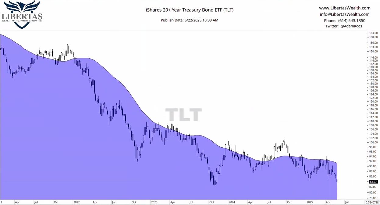
I showed this chart to my 11-year old son and asked him if he thought it was in a downtrend or an uptrend. He answered correctly, “Uptrend… obviously!”
I then asked him, if he’d invest the money he has in his savings account into this investment, and he responded, “You always say to only buy investments that are in uptrends, right?”
He gets it…
The only way I’d even consider touching long-term Treasuries would be if I put on a small position here and placed a hard-stop at the fall ’23 lows, but that’s it… and there are so, so many other, better investments to consider than what you’re looking at below.

Here’s one to watch…
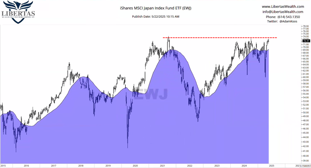
Japan has been choppy, but after a steep decline between 2021-22, it’s made a comeback and is now contesting all-time-highs – a level that’s been touched two times before since 2021.
I’m not interested until this thing proves itself, and I’d also be looking at the relative strength comparison between international and domestic stocks, as well as the relatives between Japan and the S&P500…
…but if this breaks out, there would be a pretty defined line-in-the-sand from a risk management standpoint.
Last, but certainly not least, here’s a good chart I’m definitely interested in.

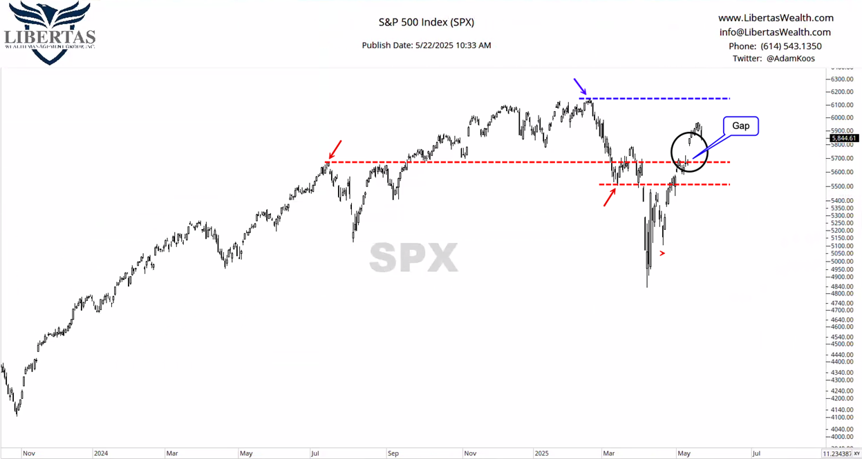
While we’re looking at the S&P500 here, we could also be looking at the DJIA or the Nasdaq Composite. Bottom line, while the short-term relative strength is in favor of international stocks, the intermediate and long-term picture still favors the U.S. over its international counterparts.
With all that being said, it’s important to understand the levels of importance here…
First, of course, is the all-time-highs (in blue). If we break out, then we’re in the green.
Secondly, the bottom edge of the gap-up, which also corresponds with the summer ’24 highs. If the market can hold above this level, even after closing the gap, I think it’s in pretty good shape.
Lastly, the March ’25 lows – below this level, I have a hard time calling this an uptrend… or even “trendless” anymore, so look out below.
With those levels defined, I think it’s pretty simple (although not “easy”) to know how much risk to take as the weeks and months move along.

Unlock exclusive gold and silver trading signals and updates that most investors don’t see. Join our free newsletter now!

